The saying goes “never judge a book by its cover,” but...well...it's hard not to sometimes. We've walked into bookshops, and picked up a book because the cover looked nice. Or decided against a book because we’d be embarrassed to be seen reading a book with that cover on the train.
A brand logo is very similar to the proverbial book cover. Creating the right aesthetic is a reflection of your brand, and might be one of the big impressions you leave on people checking out your brand. It's why large corporate entities spend countless hours designing, updating, testing, and perfecting their logos. And it's why we want to use all of that valuable information and skills employed by those giants to learn some lessons about logo design that you can take to the printer. And get printed. And attach to your creation of choice. Like a brand boss.
Hidden Figures
This is one of our favorite categories of logo design magic. Take a logo you've seen a million times. Now imagine there's a hidden message in there that's been staring you in the face for your entire life. That's the magic of the hidden message logo. Brands in this category are incorporating something core to their brand, and giving a wink to their sharp-eyed customers who notice the hidden object. Here are just a few of our favorites:
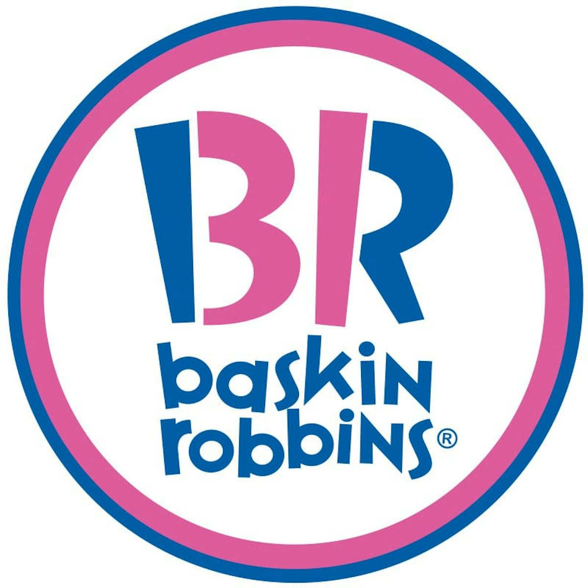
Baskin Robbins
How many flavors does Baskin Robbins have? If you didn't know the answer was 31 off the top of your head, here's a quick way to find out: see the BR design at the top of the logo? Now look in the middle of those letters. What do you see? That's right, there it is, a number 31. Now try to unsee it. It's okay, we can't either.

Nintendo Gamecube
This one is a nostalgic favorite of ours. While the cubes in the logo might be clear, what is less clear at first blush is the G that is formed with the darker cubes, and the C that is shaped from the negative space inside the logo.
FedEx
So, we know that FedEx gets things from Point A to Point B. It's their business model, it's what they do, and they're very good at it. But, have you taken a minute to look at the space between the letters? How about the white space between the “E” and the “x” in their logo? Yup, there it is, an arrow, representing their brand and what they do best!

Toblerone
Toblerone is that delicious candy that somehow makes it back as a souvenir from friends and family who were traveling internationally. It's delicious, it's ubiquitous, and it has a mountain in its logo. But, have you taken the time to look inside the mountain? It's a bear. Right there, in the logo. The bear is a nod to the Toblerone's home town of Bern, Switzerland, known as the “City of Bears.”
Let's Work Together
Partnerships, mergers, acquisitions, synergy, other corporate buzzwords. Sometimes a company's logo is revamped, revised, and updated to reflect the company they keep (and the companies that might own them). Here are a few examples of brands that give a nod to their history, and their brother and sister companies.
NBC
Our US readers are probably familiar with the NBC peacock logo. But, have you ever wondered why a peacock, and why all those colors? Well, it has to do with the history of television itself. When television was first introduced, it was in black and white. In 1956, NBC officially changed its logo to a colorful peacock. At the time, NBC was owned by RCA, a company that manufactured the newly developed color television. In a bit of corporate synergy, the NBC logo was revamped to something that showed off the full color spectrum, in order to illustrate the richness of color television and encourage viewers to upgrade from their black and white sets to color TV. From RCA, of course.
Subaru
Astronomy enthusiasts may be familiar with the Pleiades constellation, also known as the “seven sisters,” because, well, it's a constellation housing seven major stars. In Japanese, the Pleiades constellation is known as Subaru. Yup, like the brand Subaru. Looking at the logo, it only shows six stars. Tradition says, that one of the seven sisters is usually invisible, hence the six stars instead of seven. Beyond just being a cool nod to astronomy, the logo and name were also a product of a corporate merger. By 1955, six major Japanese corporations merged to create the new FHI (Fuji Heavy Industries). The newly created company wanted to produce an automobile. When trying to come up with a name and a logo, they landed on Subaru, and the six stars, representing the six companies that had come together to form the new FHI.
Audi
Continuing to drive along with this car theme, we're looking at Audi next. Anyone familiar with the car manufacturer knows those famous four interlocking rings. In 1932, Audi had a merger of four of the major car manufacturers in Germany, and wanting to reflect this new brand and new merger, they updated their logo with the four interlocking rings to represent the four newly merged companies.
Domino's Pizza
At first glance, one might look at the Domino's logo and think it's pretty cut and dry. They're called Domino's. They use dominoes in their logo. The end. But the logo is also a nod to the company's origins and the history of its locations. The one single dot represents the original Domino's location. The two dots on the other side of the domino represent the first two franchisees of Domino's.
No Place Like Home
Like Bruce Springsteen, some people are proud to say they were born in the USA. Or they might be like the Clash and hear London calling. (We'll ignore the actual lyrics of these songs and just stick with the geographic titles). Many brands like to pay homage to their homes through their brand logo design choices. Heck, even if it's not your entire design, a “made-in” label can be a great addition to your brand label. Here are some brands that couldn't resist showing off their homeland colors.
Cisco
Anyone who's encountered the corporate world in any way has probably stumbled across the Cisco logo. If you pay special attention to the lines above the company's name, you might notice something: the Golden Gate Bridge. Cisco used that electromagnetic spectrum to pay homage to its headquarter's location in San Francisco, and one of that city's most iconic landmarks. The company's nod to its hometown doesn't stop with just that logo though. What are the last five letters in San Francisco? Yup, CISCO.

Pepsi
The iconic red, white, and blue of the Pepsi logo is well-known by many. In the 1940s, in the midst of World War II, the modern Pepsi logo showing off that ubiquitous red, white, and blue was born. The company wanted to show its patriotism in the midst of World War II and decided that a red, white, and blue design was the perfect way to do this, as a reference to the American flag.

Dutch Label Shop
Clearly we're the biggest of the big brands in this feature. We know how important labels and logo design are, so of course we put a lot of thought into our own design. Dutch Label Shop went patriotic with our design choices, using tonal variations of red, white, and blue, the colors of the flag of the Netherlands. With our font choices and the shape of the logo, we wanted to invoke the idea of a label or seal of approval, since the custom labels that designers put on their clothes is like a seal of approval, too, signifying that their work is something they can officially sign their name to and endorse.

Be True to You(r Brand)
These are just a few famous logos with rich histories that gave a great deal of thought to their logo. The most important thing they all have in common is that they represent their brand and the people behind it in some way, shape, or form. They've almost all had logo redesigns at some point or another, too. When thinking about your own logo, and designing your own custom labels, try to design something true to you and what you create. And if you need to update your logo along the way, that's okay, too. Brands evolve, people evolve, and the world is in constant change, and changing your logo to go along with that is not only allowed, but expected.
We'd love to know the story behind your logo design choices. Let us know in the comments or reach out to us on Instagram, Facebook, or Twitter and mention us or use #dutchlabelshop.


